
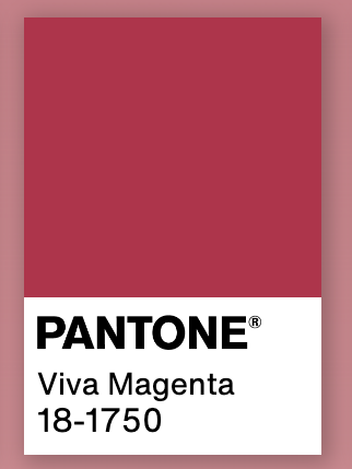
Image: Pantone.com
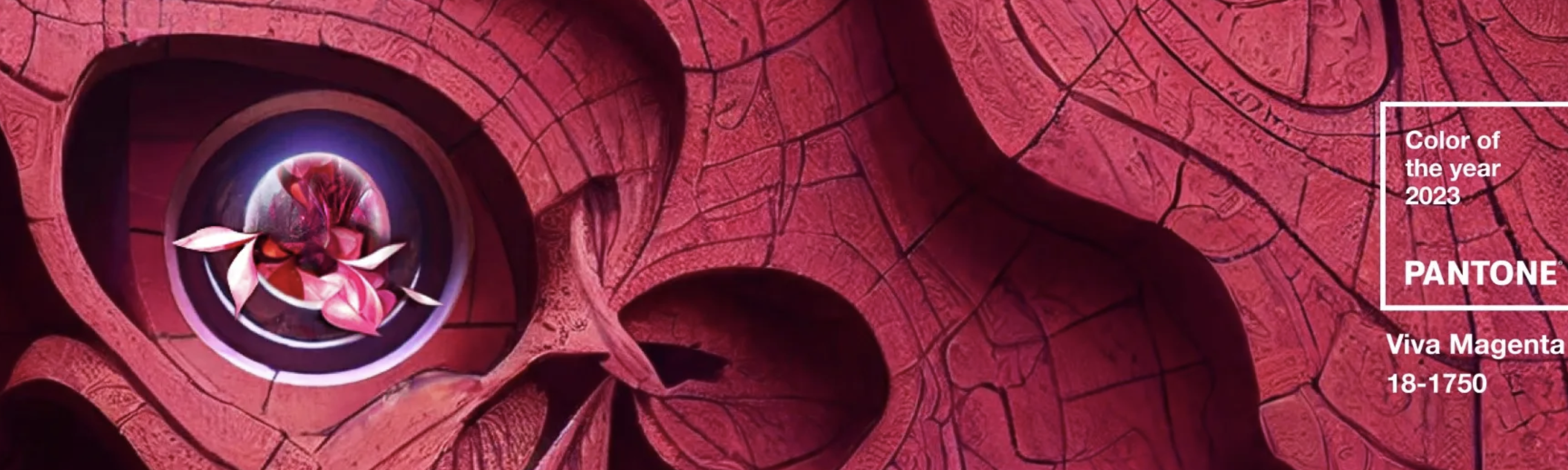
Pantone unveiled Viva Magenta as the color of 2023 a few days ago. Since then, enthusiasts and professionals have already placed it on their agendas because it will be a good bet for various decorating styles. So be prepared to find this color in paints, tiles, furniture, utensils, and kitchen equipment. Here are some curiosities about Viva Magenta.
What is Viva Magenta like?
Despite its similarity to bubblegum pink, which has recently become trendy with Barbiecore, or purple, associated with feminist causes, Viva Magenta has a distinctive personality. Pantone states “it is a hue rooted in nature that vibrates with energy and vigor; it descends from the red family and expresses a new sign of strength.”
How is the Color of the Year selected?
A global team of color experts from Pantone Color Institute searches the world for new color influences before making its selection. This can include the entertainment industry and films in production, traveling art collections and contemporary artists, fashion, all areas of design, aspirational travel destinations, new lifestyles or enjoyable escapes, as well as socio-economic conditions. Influences may also come from new technologies, materials, textures and effects that impact color, relevant social media platforms and even upcoming sporting events that capture worldwide attention.
What is the history of the Color of the Year?
The Pantone Color Institute created the Pantone Color of the Year educational program in 1999 to engage the design community and color enthusiasts worldwide in a conversation around color. They wanted to draw attention to the relationship between culture and color.
Color of the Year Impact
It is a color we see crossing all areas of design; a color that serves as an expression of a mood and an attitude on the part of the consumers, a color that will resonate around the world, a color that reflects what people are looking for, a color that can hope to answer what they feel they need.
It is one of the main influences on product development and purchasing decisions in many sectors, especially fashion and decoration. The selected color is frequently present on magazine covers and social networks, from Pinterest boards to Instagram filters. Likewise, for Pantone the selected color has an importance that goes beyond the decorative because, in the words of Laurie Pressman of the Pantone Color Institute: “society recognizes colors as a fundamental form of communication and as a way to express, capture, connect and influence ideas and emotions. For the most part, the popularity of a color is symbolic of the age we live in. ”
Pantone’s legacy
From forecasting trending colors to identifying the annual Color of the Year, Pantone’s color influence is well-known and globally recognized by all industries, roles, brands, and customers.
With the creation of the Pantone Matching System, Pantone has been a pioneer in color since the mid-1950s. This tool reduced the number of pigments needed to make any shade from 60 to 10, facilitating printing processes. In the 1960s, Pantone launched a chart of 500 shades, which has evolved to include over two thousand references updated every 18 months, including new, more precise colors. In fact, Pantone can create brand-specific colors and an exciting level of customization.
Ready to include Viva Magenta in your renovation projects? Let’s design your dream space together at Prosein Aventura Tile Store and Prosein Doral Tile Store .
Source: Pantone.com