
Pantone has presented its color for the year 2022 and is an absolute reference when talking about the main aesthetic trends. See how you can use it in your renovation project.
4 keys of the Pantone color for 2022
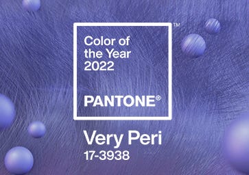
Name
Pantone 17-3938 Very Peri
Selection process
Over 23 years, a group of color experts has analyzed all market trends to select the Color of the Year. The study explores trends related to cinema, art collections, new tourist destinations, design, socioeconomic conditions, and other factors, such as trends in social media and sporting events that have had a global impact.
Tonality
In addition to having the qualities of a blue, Very Peri has a purplish red hue. It accomplishes this by combining the fidelity and reliability of blue with the energy and emotion of red. It is also directly related to the purple chosen in 2018, and it illustrates the fusion of modern life and color trends in the digital age.
Appearance
According to the Pantone Color Institute, Very Peri “displays a cheerful and lively attitude, as well as a dynamic presence that stimulates the courage to create and an imaginative expression.” When used for decorating homes, this color provides a sense of playful freshness and dynamism through unusual color combinations.
Palettes to combine
Pantone has created four palettes of different colors to match their Color of the Year. Firstly, the Balancing Act palette is made of warm and cold hues; it is designed to bring life and vibrancy to Very Peri color. Second, a mixture of natural tones is Wellspring, where the blue of Pantone 2022 highlights the compatibility of casual greens. Third, we have The Star of the Show, with classic and neutral tones that convey elegance, sobriety, and timeless sophistication. Finally, Amusements encapsulates the blend of joy and caprice playfully and spontaneously.
Match your home decor to “Very Peri”
Very Peri is a color full of possibilities. The cheerful and versatile tone can add a touch of freshness to any space. Besides the Pantone palettes already mentioned, we can also mix Very Peri with light tones such as beige or white or even something darker, such as chocolate brown.
In interiors, we can use the color in small accessories, wallpapers, or even furniture such as armchairs or side tables to serve as a focal point or enhance specific effects.
We look forward to seeing you at Prosein Doral and Prosein Aventura tile stores so we can give your remodeling project that “Very Peri” touch.