
Carrara
Choosing the colors to use in the different rooms of your home is one key to having truly welcoming spaces. We introduce you to chromotherapy and how it can help you.
Color as therapy
Think of a day when you’re just starting out, and suddenly you look up at the sky. Have you ever noticed how your mood can change whether you’re in a splendid blue or a dull gray? That’s a little proof that color and the conscious and subconscious associations you make with each hue directly influences you.
You may not have heard the term chromotherapy, but it is precisely the practice that relates the influence of particular colors on our moods and sensations. Although it has several uses, one place where it is most often put into practice is in interior decoration.
The colors you select for the walls or even the color of the decorative objects could help your home become a more welcoming and positive space that conveys calm, excitement, or inspiration.
When you set out to renovate your home, consider that choosing the colors that predominate in the different rooms is not always easy, especially if you think you must combine several colors or shades. Depending on the area of your home you are redecorating, colors will provide a sense of order, comfort, and cleanliness or will improve your mood or concentration.
Considerations for using chromotherapy
Here are some tips so you can easily put chromotherapy into practice.
First, don’t just think about paint. Of course, painting is one element you will use, but you should also consider the coatings used on walls and floors, furniture, and decorative objects.
Select the suitable tiles:
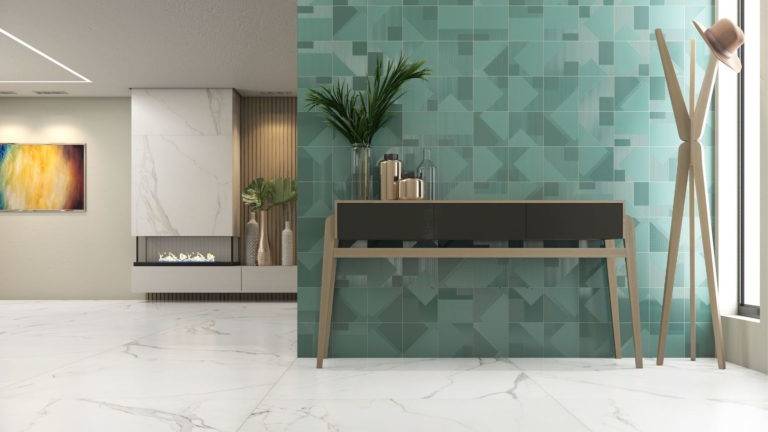
Tiles can help you make the most of the strength of colors in your decoration. For example, when you select white tile, you will have a color that brings light and transmits calm and peace with a minimalist touch. This choice will always give a sense of cleanliness, order, and spaciousness to any space where you apply it. They are ideal for kitchens, bathrooms, living rooms, bedrooms, or studios. If white seems extreme to you, ecru colors and shades of beige can give you similar results with additional colorfulness. Visit your local tile store to learn more about the different shades available.
Consider contrasts:
As appealing as it may seem to use all elements in the same color palette, dare to try contrasts to break the monotony and add your personal touch. For example, white wall coverings often work very well with furniture made of dark woods or metal structures for understated elegance. You can add vibrancy to a white base by adding green accents or use textiles in pinks and yellows for a youthful feel.
Are you ready to get started? If you have any questions about the tile options available in our Prosein Doral Tile Store and Prosein Aventura Tile Store, our consultants are ready to help.